When Ubuntu 21.10 ‘Impish Indri’ arrives this October it’ll do so with a new look in tow.
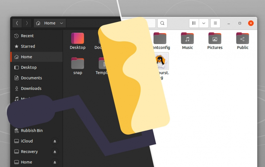
After many fine years of service Ubuntu’s iconic mix of dark header bars and light widgets is being retired.
Shocked? Well, the writing has been on the wall for a while.
Ubuntu’s community-based design team has decided that Ubuntu 21.10 will only come with a fully-light and fully-dark version of the default Yaru theme only.
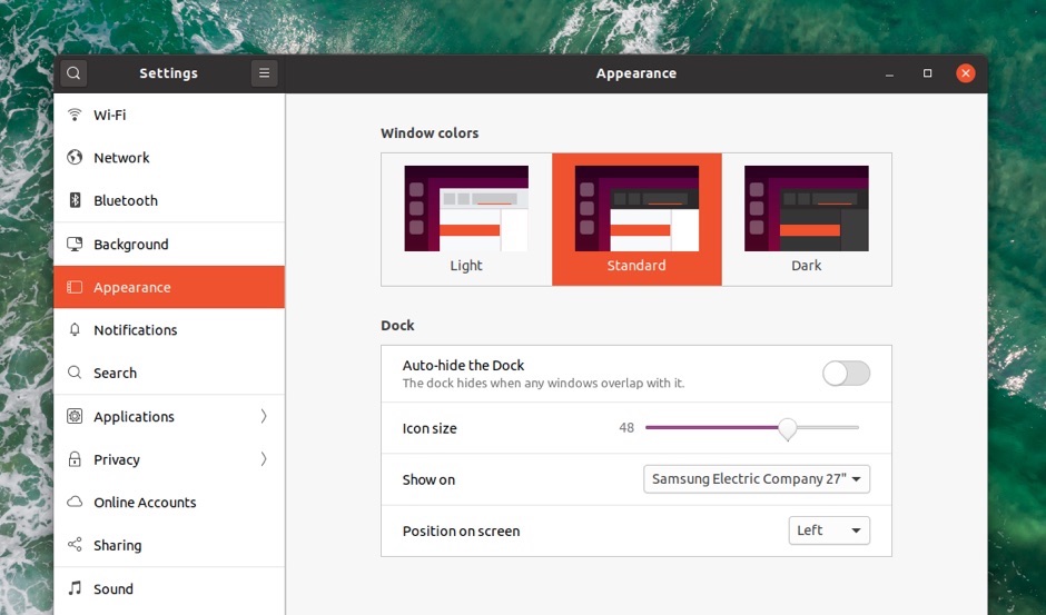
At present, Ubuntu ships with three versions of the Yaru GTK theme: Yaru (dark headerbar and light widgets; default); Yaru Light (light headerbar and light widgets); and Yaru Dark (dark headerbar and dark widgets). Users can switch between these from the Appearance pane in the Settings app.
But Ubuntu 21.10 will only offer two options: Yaru (fully light), and Yaru Dark (fully dark), with the former indicatively sitting as the default.
So what’s prompted this visual rethink?
Mixed Theme “Too Much Work” to Maintain

As we’ve mentioned before the GNOME desktop doesn’t technically support theming. Like, at all. There’s no official API, there’s no official framework, and there are no official GTK theming guidelines. Almost every new release of GNOME “breaks” third-party themes — and that’s not exactly GNOME’s problem; themes are built on shifting sands.
Then there’s GTK4. Ubuntu (like other GNOME-based distros) is going to need to transition to GTK4 over the next few years. But GTK4 doesn’t appear to support a mix of dark header bars and light widgets; they’re either all light, or all dark.
Ubuntu’s group of theme enthusiasts say maintaining the inverted title bar going forward is simply “too much work".
Now, this isn’t the first time the community-based Yaru team has pushed for this decision. Ubuntu switched to an all-light theme for a short time during the Ubuntu 19.10 development cycle. Public consternation with that decision saw them back-pedal promptly.
However this time the Canonical branding team is on board with the switch, describing the move as the “smartest choice” available.
Ubuntu is rather unique in using a mixed theme. Most major operating systems (and many other Linux distros) don’t offer one at all. Dark theme is all dark, light is all light. Android, Windows, macOS, Chrome OS… all offer a binary choice.
But I do wonder: why doesn’t Ubuntu just use Adwaita by default?
Adwaita is well tested, complete, and popular with community developers. Yaru is, after all, an Adwaita fork and, in its light guise (though I appreciate it’s subjective) it’s a fairly pale tribute to Adwaita.
Or to put it another way: Ubuntu needs to look good, not watered down. If the practicalities of a mixed theme make it a non-starter — this appears to be the case — then whatever takes its place should look just as good, if not better.
Can Yaru Light really be described as that?
Keep in mind that the Yaru GTK theme is independent of Ubuntu’s GNOME Shell theme. The latter has ping-ponged between light and dark a few times over the past few years. It also, notably, can’t be changed without installing the GNOME Tweaks tool or a theme-switching GNOME extension.
More visual changes coming
Fully-light/dark themes aren’t the only visual change coming to Ubuntu 21.10. The Yaru developers have been told to prepare to remove/reduce/replace aubergine (aka purple) colored accents throughout the theme. This is part of a wider Ubuntu rebranding effort currently underway. The replacement color hasn’t been mentioned yet.
Link: https://www.omgubuntu.co.uk/2021/06/ubuntu-21-10-yarn-theme-change


